Pages

Thursday, 18 October 2012

How to change the background in Blogger

Changing your background on your blog
 
One of the really nice things about having a blog is showing your individuality. So of course I wanted my background to reflect my personality. Being new to blogger it was a little scary but I do like to play around with things. I am definately not an expert so this is just friendly advice :) 
 
 This is how I changed my background.
 
I started in my blog dashboard. On the left hand side you will see the options above.
 
(Click on the pictures to enlarge them if you can not see clearly.) 
 
Go all the way down to template and click on it. A new menu will open which will look like the one below. Click on customise.
 
 
The next menu that comes up will be the template designer. This is where you can customise your backgrounds and lettering. Click on the second one down which is of course background.


You will now see the options for changing the background. There will be a square that has the current background showing in it. Underneath it says 'remove background'. Click on this.
 
Double click inside the now empty square and a menu will pop up that lets you browse your computer for a new background. Something to keep in mind here however, is that it must be under 300kb which is quite small.
 
Option 1. Choose a small seamless tile image, once uploaded check the tile option. This will cover your blog in a repeat pattern.
 
Option 2. Save the background you want at a lower resolution. I put mine in photoshop, save as a JPG and play around with the saving options until I am able to get it under 300. This can sometimes be tricky and sometimes requires you to save, reopen and save again at a lower resolution. This will also mean the clarity of your work can suffer.
 
Option 3. Open the background that you want in photoshop. Click on the windows symbol on the bottom tool bar. Click on 'all programs' and find 'Snipping tool'. Click on this, then snip exactly around the background paper and save. This will be a low resolution image but good enough for a background.
 
I then ticked the box which says scroll with page. Try it both ways and see which you like
 
I changed the color of my words using the 'Main color theme' and chose a color to match my paper.
 
Finally there is a big orange box on the upper right hand side that says 'apply to blog' click on this to save your background.
 
The best bit is checking out your blog to see what it looks like. I found it took a few tries before I settled on a paper I liked.
 
Have fun changing your background. I look forward to seeing them.
 
Claire
 

Sunday, 7 October 2012

How to make simple embosed paper in photoshop elements

How to make an embossed overlay texture in photoshop elements

This tutorial will teach you how to make a textured overlay which will give an embossed look to your background papers. I am sure there are many ways to do this but I think this one is quite simple and very versatile. It can be very subtle or more intense. Click on the photos to enlarge them, this will make them easier to see.


To start your paper we will be using the polka dot technique. If you haven't read this tutorial you may want to refer to it to refresh your memory.

Create a new window that is 2 cm by 2cm, transparent and 300 dpi per inch. Using your rulers section your square into quarters at the 1cm mark. Choose a shape for your embossing, I chose to use a star.

Pick a mid grey color and make the two shapes as with the polka dot method.


Save this as a PSD file. I called mine star emboss. Now open a new window that is 30cm by 30cm. Choose a mid grey color and make a layer of that color.

Go to filter at the top. Click on it and go to texture and then texturiser. A new menu window will open

 
Go to the fourth box down and look to the right, there will be a tiny arrow. Click on it. A box will come up which says load texture. Click on that and a new window will come up with PSD files. Your file should be there. Click on it and your texture will load. Now use this like any other texture. Change the size and depth of it until you are happy. I would advise not too deep a relief.
 
You will now have a grey paper that is covered in stars that are indented. This can be used in two ways. As it is, or inverted.
 
You now have your textured paper, how do you use it.
 
 Open up one of your background papers. Drag and drop your textured paper over it and make it the top layer. Go to the layer choices and choose either soft light or overlay. This will give you a texture of indented stars.
 
If you would rather have the stars coming up instead. Click on the star layer and press control I. This will invert the image.
The effect is a subtle texture all over your paper.
 
 
Save this texture separately in a texture file. Keep all the textures you make for when you are making papers.
 

Wednesday, 3 October 2012

I would like to make a simple shiny button using photoshop elements

I would like to make a simple shiny button using photoshop elements
 
 
When making my scrap booking I do like to have some shiny buttons. Sometimes I use them for flower centers, as with this flower and sometimes I put the flowers in them :) the nice thing about this tutorial is that it is quick to make.
 
 
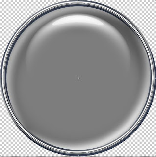
When it is finished you will have a button that is in layers and looks like the one below. Once made you will be able to fill it with papers, word-art or flowers and make it individual to your artwork. The buttons are really effective and we will be using some techniques you already know and show you some features which we haven't used yet. Like everything I do, once you have mastered it you will find lots of ways to use it in your other projects. Many things I do I learn by accident and this was one such happy accident.
 
 
Open a new window, 3cm by 3cm, 300 dpi and transparent. In your first layer put a solid circle 3cm by 3cm. Name it base circle.
 
In the layer above put a 'thin outline frame' circle again 3cm by 3cm, Name it rim layer. Select each layer and using the magic wand tool click and simplify each shape. Press control D to get rid of the marching ants.
 
Select the second layer and using the wand tool again click in the center, this will give marching ants on the inside ring. Select the first solid circle layer and click control and J. This will give you a new third layer that has a circle the exact size of the inner ring. Make this the top layer and name it inner circle or glass layer.
 
You now have 3 layers which look like this: click on the pictures to get them to enlarge so you can see them clearly.
 
 
On the right hand side menu is the effects tab, click on this, then on the second window in which is layer styles. Choose wow chrome. We will be using the 4th one called wow chrome shiny edge.
 
 
Starting with your base layer click on it and then click apply. This should give you a shiny round disc. In the layer an italic fx should now have appeared in the right hand corner. Hide the top 2 layers so you can see the base layer.
 
 
I want you to click on the fx to get the fx menu. Then uncheck the drop shadow and take the bevel to zero.


You will have a flat silver disc with a slight bevel. Hide this layer and go to the rim layer. Apply the wow shiny edge to this layer, go into fx and untick drop shadow, however, this time instead of taking bevel to zero, use the slider and move it gradually up and down until you find the best position for a shiny edge. I used 24.

Now click on the top layer. This time choose 'wow plastic' and apply wow plastic clear. Go into fx and uncheck drop shadow and glow. This will give a clear glass like layer over the top of your base circle. Your button should now look like picture 2.

For a little extra white shine, hide all the layers except the top glass layer. Open a new 3cm by 3cm window and drag the glass into it. Using the wand tool click on the white moon crescent shine at the top, it should now be selected, if enough is not selected go to the top menu and click on the select tab and go down to grow, do this until you have a nice crescent amount of white. Click control J. Hide the first layer and drag that crescent back into the button window. This will be your top accent layer. Use the directional buttons to get it just where you want it. Ta da! You are now done!

Your button should now have four layers.  To change the color of the base layer... drag and drop a paper of your choice above it. Now click control and G at the same time to clip the paper to the base shape.

In the layer above your paper (or color) choice you can drop some wordart, or a flower, any element you like.


Once you have the paper and element go to the glass layer and click on it. Using the opacity slider, change the opacity until the glass is just enough to show without obscuring what is inside.You should now have a button that looks similar to this:

 
If you would prefer a gold rim, hide all the layers except the rim. Drop it into the new window. Under effects choose photographic and then sepia tone. Click apply. Make sure no other layer is showing and drop back into the button window, align over the button:
 
 
your rim should be a nice light gold color. For a brighter gold choose yellow tone.
 
Have fun with your button :)


Monday, 1 October 2012

I would like to make a pinwheel flower in photoshop elements

I would like to make a pinwheel flower in photoshop elements
 
This tutorial follows on from my other tutorials: how to make a ricrac ribbon; how to make a flower and how to make patterns for background papers. For this reason I will not be going into great detail about how to make certain elements, only referring you to the pages which they are on. If a word is highlighted in a different color it is a link, please click on it if you need to familiarise yourself with the technique. This tutorial is more like a recipe in that we will take already prepared ingredients and combine them to make something new and hopefully very pretty.
 
When you think of most things around you in the world they can all be broken down into basic shapes. Think of fuzzy felt when you where a child, a box of basic shapes that one day were a rocket and the next a house. When I make my elements this is often how I build them. I break them down into easy basic parts and then reassemble them.
 
Today we will look at the techniques I have shown you in the past, and how using them can create something like this:
 
Other than the button in the middle which you can learn from this new tutorial, you will already know how to make this flower. Look at it very carefully and see what you can already do.
 
The most obvious thing perhaps will be the papers. You have already learned how to do a swiss dot pattern, a polka dot pattern and a checked pattern. Some of the papers combine all three techniques, literally patterns laid over patterns and then saved in a jpg form.
 
Then there is the ricrac ribbon. You will already know how to create this shape so that would be the stem sorted out for you.
 
Now think about how we used the custom shape tool, the one on the left hand menu with a heart in it. So you know how to create a shape and more specifically a heart shape.
 
If you think about the how to make a flower tutorial, you also know how to make a row of five petals and turn them into a flower. So with these ingredients I will take you through how I made the flower above.
 
I began by making myself some papers. I chose to use a palette of pinks and white. I have used three different papers in this flower.
 
The first is a dusky pink background with white polka dots, the second is the same paper but with a lighter pink background and polka dot roses over the top in a wider spacing
 
 
the third uses the same rose pattern, this time in the swiss dot formation close together, with a checked pattern over the top. All of these papers can be made using my tutorials. By making your own papers you can coordinate a group that can be used together in a patchwork.
 
First assignment
 
Using your knowledge base spend some time creating about 5 or 6 background papers to use for making your flower. This will give you some choice and flexibility. They can be as simple or as complicated as you like. As you know, I like you to have fun and be yourself. When this tutorial is over you will have your own unique creation.
 
Back so soon :) I was still making papers...
 
Have your pre-made papers opened in separate windows. For convenience you can drop them all into one window on 5 separate layers. I do this because if I come back to a project I have the 5 I used all there at my disposal :)
 
Stem
 
In this tutorial I am going to give you approximate measurements because I want you to have full control over what you make. 
 
We will start with the stem as this is the first layer and pretty easy. Open a window with your ricrac ribbon in it. Using rotate (image tab on top menu, then rotate, then 90 left) put your ribbon so that it is vertical. You just need a small length, probably about 10 cms. Using the rectangular marquee box mark the right length and click control J, this will leave your original in case you need to change anything later. Hide the original layer.
 
Take a paper of your choice and drop it into the same window as the stem. Do this by looking for it in your project box at the bottom of the screen, clicking on it and then dragging and dropping into your open stem window. It should be the top layer. If it isn't drag it to the top.
 
Re-size the paper using your move tool until the pattern is a good size for your stem. Try not to make it too small as details will be lost and the pattern will blur. Once you have it the right size for your taste click control and G at the same time. This will clip your paper to the ricrac shape. While it is in this window you can use the directional buttons to move it around until the pattern is in the best place on the ribbon.
 
I choose at this stage to open a new working window for my flower. I would recommend about 10cm by 10 cm up to about 20 cm by 20 cm. Partly personal preference, partly how big you want your finished flower. Once in this window the ricrac will stay as a patterned piece and can not be changed back. This however is good as it means we can do more things with it. This is your first building block and will be layer 1.
 
Second Assignment
 
Making your petals. Choose what shape you would like your petals to be. Would you like heart shaped ones as I have done above, or more traditional shaped ones. Once you have chosen your shape open a new window, I would probably make it about 1cm by 1cm. Make your shape in the middle and follow how to make a flower.
 
The one above is a heart shape, made into a row, five petals have been chosen and then turned into a flower. You may choose what shape petals you use and how many you use. With each shape choosen you may have to play around with how much stretch you need for it to look a normalish shape after using the polar co-ordinates. It will not be perfect but this can be covered with your center button as with the flower. The larger the petal width the more space for your patterned paper to show, this is why I choose 5 petals.
 
I hope you will all now have a round of petals that you like and are happy to move forward. As with the ricrac above drop a paper into the window and size as desired. Once in the right place use control G. Finely adjust placement.
 
Open the ricrac window again by double clicking on it in the project bin. Drop your newly patterned petal layer into it. This will be your second layer.
 
As I am sure you will have worked out you need 2 more of these layers. So go back to the petal window and drop 2 more pieces of your paper into it and follow the above until you have your desired petals. Drop these into your working window, you will now have four layers, stem, bottom petals ,middle petals , and top petal layers.
 
Using the move tool resize these until you have  3 different sizes, small on top down to large at the bottom. Then use align to center them. Finally use move tool to rotate each to a slightly different position.
 
Line the ricrac layer underneath so that it looks proportionately correct and center it. You should now have basically what I have above, but your own unique version of it.
 
Whats left? Two things will finish this flower off, firstly a nice center, I have used a glass button, you can choose anything that you have which is suitable, a nice wooden button, perhaps one with a string bow in would be nice. If you have nothing at all suitable, using the techniques you have learned above choose a different paper and make a circle. Make this the top layer and center it.
 
Lastly we will make this flower pop with some drop shadows. I like to play around with my shadows, so I start by using the drop shadow menu in effects on the far right and I choose the last one which is soft shadow.
 
Once applied I click on the italic fx that will appear in its layer and I use the sliders to get a very light low shadow... something like: size 16, distance 9, and opacity 25. 
 
I add this to each individual layer. It helps to put a white layer under all your pieces so that you can see where and how your shadows look.
 
Suddenly your flower will pop and each individual layer will show up as with the flower above. Remember though... after adding shadow and saving the flower in a PNG format (without the white background) it will be hard to change. This is because shadow is tricky to remove. For this reason you MUST save your flower as a PSD file first to keep all your separate layers, this way you can remove shadow if you don't need or like it.
 
Are you happy with your flower? Have you saved the file as a PSD. You may now save the flower as a PNG.
 
Check using your white background where your shadow is and marquee around this. Hide the white background, crop and save as a PNG. Why did I do this? Because if you select and crop it often cuts off the shadow and you get a square edged shadow, very weird! Using the white background lets you see where your shadow is, but you don't want it in a PNG so you hide it :)


Friday, 14 September 2012

I would like to make a vellum paper scrap

Vellum Paper Scrap
 
If you have arrived here not having read any of my tutorials you will firstly need to go to 'how to make ricrac' and then 'how to make crystal ricrac' before you can make your vellum paper.
 
I left you with a really nice piece of crystal ricrac ribbon. Made up of 3 layers, the original, the edge and the fill. Hide all the layers except the outer edge layer. Using your marquee tool make a box around one edge. Try to start at the beginning of a wave and end at another. Get about 6 waves in. Click control J. You will now have just one edge. Hide the layer below.
 

It should look like this. I have clipped it so you can see closely, but of course the original box is bigger. Select this by clicking in the layer icon (you know how to do this now). Go to the top menu, click on image then crop.

Open a new window 10cms high by 10 cms wide. It may be a bit big but it doesn't mater. Drag and drop your wavy edge into it. We are now going to build the edges of our paper scrap.

It doesn't take a genius to work out you will need 4 sides. We are going to make three more layers of the wavy line and use rotate to get them in the right direction.

 Click on your layer and drag it down to the new layer box (yes the tiny square you usually click on to get a new layer) tada, you now have 2 layers of your wavy line. Click on the new layer and rotate it 90 degrees right using the image tab at the top. Click image, rotate and then go down to layer 90 degree rotate. This way just one wavy line rotates. Repeat this step twice more until you have four wavy lines.

Using the move tool make your lines into a box. Once you click on them in move mode you can use the cursers keys left, right, up, down to fine adjust. You must make sure though that all the corners touch perfectly. You can do this by eye, unless you are OCD like me.

If you are OCD use align. Make sure the two outer edges are both aligned at the bottom. Then align the top, bottom and left using the left align. Finally select the two sides and the top and align to the top. A bit long winded but you will get the perfect square.


Go to the layer tab on the top menu, go down to merge visible. You will now have the outside edge to your paper scrap.

Pick the magic wand tool from the left hand tool menu, it looks like a stick with a flash on the end. Click in the middle of your square. Just the inside edge will have marching ants. Create a new layer and flood fill using paint bucket and your desired color. I am choosing a slightly off white. Use control D to deselect the marching ants. I think you know where we are now. Change the opacity of the fill to 60%. Merge all layers. You now have your vellum paper scrap.

 
This time shown over a rather attractive piece of patterned paper :)
 
Why stop here though, change the color of the edging to match your color scheme. Have the vellum in other colors.
 
Before you merge add a water mark to the vellum. Pick your water mark, lay it over the vellum and use the menu in layers where it says normal and pick soft light and the change the opacity.


I have added a swirl pattern, its very faint lol.

Think outside the box...make an oblong! When you make your four sides cut two down by a wave or two and assemble as above.

 
The permutations are endless. Think about what you have learned and how you can apply it to other projects. Never make one thing when you can make three lol.


I would like to make crystal ricrac ribbon in photoshop elements

Crystal ricrac ribbon
 
To begin with you will need to make a ricrac ribbon. Luckily for you there is a wonderful tutorial that tells you exactly how to do it and you will find it here
 
Open a new window 20 cm by 20 cm and drag and drop your ric rac into it. Holding down the control button click on the picture of your ricrac in the layers section. This will select the ricrac.

Go to the menu at the top and click on the select tab, I think this may be the first time I have sent you here. As usual there is a drop down menu. Go down to modify and then click on contract. Using this will shrink the marching ants by the amount you specify. Put the value 2 in the box and click ok. You may have to magnify to see it but the marching ants will now be inside the edge of the ribbon.
 
Click in the new layer box to open a new layer. Pick a color that is very similar to the ricrac ribbon you are using, to be very specific you can use the eye dropper tool.
 
The eyedropper tool is quite simple to use. Look at the left hand side menu and find the one that looks like an eyedropper :) click on it. Now click on your element where you like the color. Check in your foreground color box, it will now match that color.
 
Making sure you have your new layer selected fill using the paint bucket tool. You will now have 2 layers, one with your element and one with a slightly smaller, solid color fill ricrac ribbon.
 
 
Click on the above picture if it is too small to see clearly.
 
You should see two layers in the layer box and a slightly darker edge around the ribbon showing from the bottom layer. Your fill layer should still be selected so now hold down control, the up arrow key above control and the I key. This selects the inverse area around the fill layer. Next click on the layer with your original ricrac ribbon in and click control J. A new layer will appear which has only the edge of the original layer in it.
 
 
Cool or what. If you get confused at any time please feel free to read my glossary of control short cuts.
 
Make visible only the 2 new layers while hiding the original. You will see that together they are a perfect match. Select the fill layer and go to the layer palette. Here you will find a box, next to where it says normal, that says opacity. Click on it. There is a slider that gives a percentage from transparent 0% to solid 100%. I set mine at 65%.  As you know though I like you to play around with photoshop, so give it a go. Play with the slider :)
 
Now to test out how your crystal ribbon looks. Open a window with a piece of background paper in it. Drag and drop your ribbon into it. It should have a solid outer edge and a semi transparent main body that you can see your paper through.
 
 
Here is mine over some check paper, which you can learn how to do in my making a tartan check background tutorial. Its very effective isn't it? Especially if you used the texture layer when you made the ricrac, as it makes it look like a stitched edge.


If you find that your outer edge is a bit thin, or a bit light there are things you can do.
 
1. Make the ribbon again but this time put a value of 3 in the contract box, this will give you a thicker edge.
 
2. Make a duplicate layer of the edge, go to the layers menu and click where it says normal. Select multiply. Use the opacity slider to get the right level of color.

This was pretty cool huh? And I bet people will be asking how on earth you did it :) would you like to make something else with this technique? I am a big believer in recycling, using bits of one thing to make another. So how about some scrap vellum paper?


I would like to make ricrac ribbon using photoshop elements

Ricrac Ribbon
 
This will be a nice easy tutorial and give results straight away :) I can see you smiling already after reading some of my tutorials. The great thing about this one is it can be as simple or complicated as you like. I will start with the simple.
 
Open a new window, 20 cm by 20 cm, 300 per inch,RGB, transparent and name it ricrac. Either place a piece of ribbon element into the box or use your marquee tool to mark out a 1cm by 20 cm box and using the paint bucket tool flood fill with the color of your choice. Control D to get rid of the marching ants. So you will have this:
 
 
The top one is the flood filled box before deselect and the bottom one is a ribbon I made. Click on the box to enlarge it if you can't see very well.
 
Now is the time to add some texture if you like. I made a texture to give the effect of the stripey lines you get on ricrac. You should be able to right click on it and 'save as' then use on your ribbon. Or you could go into the filter tab and go down to texturiser, then textures and choose from burlap or canvas, both are nice.
 

Lay the downloaded texture over the top of your ribbon and using the move tool stretch to fit. Go to the layers box and click where it says normal, a menu will drop down. I tried a few to see which one I liked the best. Soft light was good, as was linear burn. Use control G to make sure there are no overlapping areas and merge visible.
 
(If you think you will be doing more editing on the texture stage then drop the ribbon into a new 20cm by 20cm box by opening a new window, clicking on the ribbon window in the project box and drag and dropping into the new window.)
 
You now have a ribbon with a texture to it ready to be turned into ricrac. Go to filter tab on the top menu. Click and go down to distort, now click on wave. A new box will appear. It will look like this.
 
 
First box says number of ...put 3
 
Next box across says type... click on the dot that says sine
 
In wavelength put.... 62... 62
 
Amplitude put...10...15
 
Scale put...1...53
 
Undefined areas put...wrap around
 
Now click OK. You are finished. Below is what mine looked like using the texture on soft light.
 
 
This is one where I made the texture slightly narrower than the ribbon and used linear burn to make the texture more apparent.
 
 
So that is it. I hope you found this an easy to follow tutorial, let me know if there are any bits that are confusing.
 
Claire