Pages

Friday, 14 September 2012

I want to select a shape that I have made in a layer.

Selecting a shape in a layer
 
I want to select an element
 
Sometimes when making an element you will want to select it's exact shape to use for another layer. By selecting it you will have marching ants around every nook and cranny for an exact replication of the shape. For example you may have a leaf shape that you would like to recreate to make a gradient layer over.
 
There are two ways you can do this. click on the picture to enlarge so you can see better.


1. Using your marquee tool make a large square around the item you wish to select. Now click on the move tool, the very first tool on the left hand side and using the directional keys click left or right (your choice) the layer will now be selected. Now click once back in the opposite direction to put the selected item back where it was. This is important if you are laying a lot of pieces.
 
2. Holding down the control key go to the right of your screen to where the layers are. Find the layer that you want to select. In the layer is a little box with a tiny picture of your element. This is called the icon box. Still holding down control key, click on the picture. Your element will now be surrounded by marching ants.
 
I want to make a replica shape of my element using a pattern layer I already have.
 
Now you have this selection you can create another layer and fill it, or you can select a layer that has another fill or element and holding down the control button and the J button at the same time make a replica of your element in a new layer using the selected pattern layer.
 
I want to deselect
 
To deselect the item click control and d at the same time.
 
I want to select the inverse area (everything but the element)
 
If you want to select everything but your element follow either of the above methods, then holding down the control key hit the up arrow above it and the i button at the same time. This selects the inverse area. Now the marching ants will be everywhere except your element. This is very useful when making elements. For example you may want to select a shape to cut out of another shape leaving behind a nice patterned hole. An example of this is used in how to make scalloped edging.


Thursday, 13 September 2012

How to make a realistic flower using photoshop elements.

How to make a flower.
 
 
I always see such lovely flowers made by other designers, some which look like photographs and others that are made using photoshop, so I thought I would have a go at making some for myself as I do like to play around with different things and see what happens.

Click on my photos if you need to see them clearer and they will enlarge.
 
I got myself a picture of a petal, the one I used was royalty free, but you can photograph one, or get a CU one as I did from the Internet. This is the one I chose.


The good thing about this one is that it is CU and has a white background. Open in photoshop. Then drag and drop in a new window, 10 cm by  10cm, 300 dpi, transparent. Enlarge the petal.
 
Using the magic eraser (right click on eraser and chose the one with the star on it) I clicked on the white background and was left with just the petal. There was a little white around the edge and I used the normal eraser to clean up the edges.
 
Then I right clicked on the image in move option and chose edit layer style. When the style layer box came up I clicked on stroke. This puts a black line around the petal and gives you the chance to see if you have missed any pixels. Using the eraser I got rid of any stray pixels.


 To clear the stroke right click again on the image and choose clear layer style. This method can be used on any picture, however plain backgrounds are better.
 
So I had my petal, but what I really needed was lots of different petals. I opened a new window 10cm by 10cm. At the top I started to makes lots of petals using my one petal.
 
 
I hope you can see all the layers of separate petals in the picture above, if not click on the picture and it will enlarge. I used rotate to change some to mirror image. I made some thinner. I had some overlapping, and some gaps, because I wanted it to look realistic. A few of the petals I gave a really light low shadow to, to make them appear slightly in front.
 
Once I had  a row of petals I cut one in half and put one half at each side. This meant I could go to edit tab along the top, then save the pattern using define pattern. I named it petals.
 
As I have done in other tutorials I made a new layer by clicking on layer tab at the top and then new fill layer. As you can see in the photo above I could now make rows with as many petals as I wanted. This is great forward thinking as it opens up so many new projects with the ground work already done :)
 
I now had rows of petals, but in the layer window as they are they are not editable. I opened a new window and dragged the rows into it. Using the marquee tool I surrounded one row and clicked control J giving me a new layer with just one row of petals. Now the fun begins.


Take the row right to the top, and have them so only half the petal shows. Surround with the marquee tool and control j again. this gives one row of half petals. Hide all other layers. Go to filter, then distort, then polar coordinates. Click rectangle to polar.


You now have quite a nice realistic looking flower.  I made another layer, and I sized it slightly smaller. Then in move I clicked both layers holding down the control button so that both went dark showing they are selected. I clicked on align on the top tool bar menu and aligned horizontally and vertically the centres. Then I rotated the top layer by eye until I liked the result. I gave both layers a drop shadow.
 
I chose a nice diamond to put in the middle of the flower, and gave that a drop shadow too. If you would like to make a button center this is also very effective
 
Play around with this method. Use more petals. Stretch the petals further before the polar coordinates. Make 2 or three layers of the flower, and vary the sizes. Use the align at the top to make them perfectly aligned with each other. Choose to add a drop shadows or not and a jewel for the centre.


And voila a really nice flower :)
 

This one was made using more petals and stretched further. This one was stretched even further and uses more layers, with varying colors.
They look pretty realistic don't they? I was pleased with my mornings work.
 
I even combined with my ribbon frame to make a nice picture frame.
 
 
I hope yours turn out as nice. Let me know how you got on and send me pictures of your creations :)

Monday, 10 September 2012

I would like to make a check or tartan pattern for background paper

I would like to make tartan paper/fabric in phtoshop elements
 
This one is super easy and the results are pretty good ;)
 
Open a window 5cm by 5cm, 300 per inch resolution,rgb,transparent.
 
All of the instructions I will use have been covered in my other tutorials so if there is something you come across that you are confused about, try reading how to make a perfect circle frame, or how to make a swiss dot pattern.
 
You have a choice, you can either choose 5 papers that you really like....or 5 colors that you really like.
 
If you are choosing colors then using the marquee tool mark out a 1cm by 5cm box and fill with a colour.
 
If you find it difficult to be exact pull out the rulers to 1cm spacing, then repeat until you have five different colors OR make one box, then duplicate the layer and change the color using the paint bucket tool... . do this 5 times with 5 different colors.
 
Spread evenly across the box with no gaps like this. If there are gaps, squish them all up, go to layer and click  merge visible which is second from last and then stretch the layer to fit the window.
 
 
Or choose five papers you like and make the same arrangement. Again merge the visible layers using merge visible tab.
 
Now you have one layer with 5 stripes. Duplicate this layer.
 
Go to the image tab on the top row, click on it and click on rotate. A menu will pop out to the side. It's a bit tricky this one, you have to go across and stay on it or it will disappear, (really annoying sometimes but persevere). Go right down the list staying on the menu until you get to layer 90 left. It has to be this one, or otherwise both the layers turn 90 to the left. Click on it.
 
You will now have 2 layers, one horizontal, one vertical.
 
 
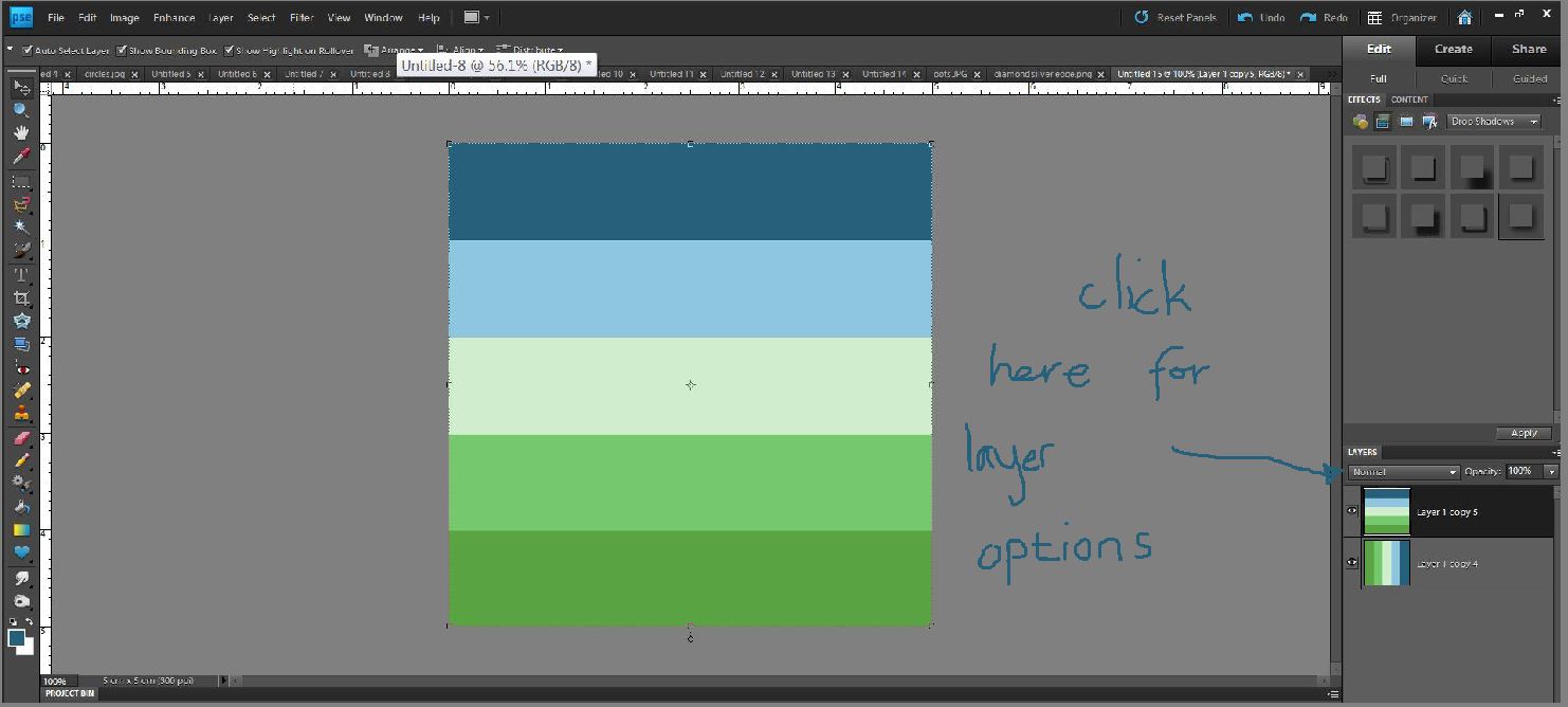
Click on layers where it says normal. The menu will come down. Click on normal and then use your directional keys to scroll through the menu. Watch what happens to the two layers. I usually use soft light, but check them all out. It's good to see how they change the colors.
 
 
I have chosen soft light and it looks like this. I like it a lot, a bit like one of Dougs shirts lol :)
 
Go to edit, then down to define pattern, (we use this a lot don't we). Save it with a witty name, I'm going with Dougs shirt...cos it makes me smile.
 
Open a new window 30 cm by 30 cm. Go to the layer tab on the top row, click on it, go down to new fill layer, your pattern will be the default pattern fill so click ok.
 
Change the scale right down to between 5 and 20
 
This is scale 5%

 
This is scale 15%


A very decent tartan or check paper. Time to add a bit of texture.
 
Go to the Filter tab on the top menu, go down to texture and click, then down to texturiser and click. A nice new menu will open. The forth box down is the one we are interested in. Click on it and choose one. I quite like canvas, but burlap is nice too. Try them out, if you don't like the results then press control Z and try another. It is going to be a bit of trial and error to start with :)
 
 
Sometimes it doesn't show up very well, sometimes it makes all the difference.

 
Here is one I made using 5 different papers. The papers are available in the free mini kit I have on my blog page
 
 
Here you can read my blog, and get some free elements and papers as well as read my other tutorials.
 
Good luck :)


I want to make a flower in photoshop elements

How to make a flower in photoshop elements.
 
This is going to be a simple flower. Once you can make one flower it can be used to make lots of things. I am sure there are lots of ways to make flowers, but this one is fun ;)
 
Okay so open a window that is 1cm wide by 2 cm high with the usual parameters: resolution 300 per inch, rgb, transparent.
 
 
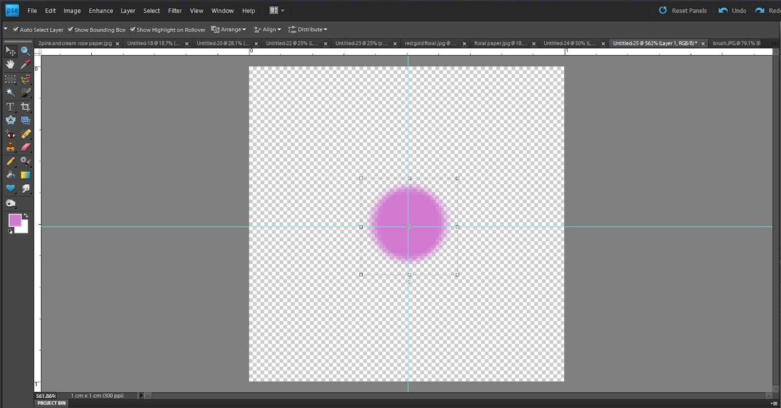
Now in the middle of this put a 1 cm circle using the shape tool. I have used white as it shows up well, also daisies are quite often white, but you can choose any color you like. The circle will be edge to edge but have room above and below. Click on the circle with the magic wand tool. Now say abracadabra! Just kidding, it's not quite that magic. A box will open saying do you want to simplify the shape. Click yes. Then click control D to get rid of the marching ants.
 
 Go to the edit tab, go down to define pattern and click. Now name your pattern. I named mine white dot...because it was a white dot.

Open a new window, this time 10cm by 10 cm, usual parameters. Go to the layer tab and click on it. Down to new fill layer, then pattern and click. The last pattern you saved will be the default setting so click ok.

You will now have rows with 10 dots across. This is going to be very handy, however, it is not editable in the way we need it in this window. Open another window 10cm by 10 cm. Drag and drop the rows of dots into this window. They will now be editable.


I hope you can see from the picture above that we have gone from one dot, to a layer fill of dots, to a drag and drop of the layer fill. 
 
On the new window, using your rectangular marquee tool, go around one row of dots from end to end. Then click control J. You now have a layer with a row of dots. Hide the layer below, but keep it to use as an endless supply of petals. This way you can experiment without having to undo anything.
 
Using the move tool expand the petals from top to bottom filling the box. The petals can touch the top but not the bottom as it distorts the petal edge. If you would like to add some texture to the petals now is the time to do it. This is because if you wait until later the texture will be in one direction rather than around the flower.
 
 
Now the magic is coming. Go to the filter tab and click, go down to distort, polar coordinates (yes we have been here before...well done for remembering) and click on rectangle to polar and then click ok.


Do you have this? Phew!
 
Already you have a pretty good flower right. Your welcome ;)
 
What can you do with this really nice flower. Quite a lot. If you have a nice jewel you can put it into the centre.
 
 
Quite pretty? To get the jewel right in the middle of the flower click on the flower layer holding down the control button and then the jewel layer holding down the control button, both will go darker showing they are both selected. Go to the top tabs menu, there will be one saying align. If it isn't there click on the move icon. Choose firstly align vertical centres. Then click on it again and choose align horizontal layers. The jewel will now be in the middle.
 
This will now make a pretty flower. If you would like to add a drop shadow I would recomend opening a new layer and adding a background color, this gives you an idea of how the shadow will look against your chosen page. Remember to hide before you save your final flower. The shadow comes under the effects tab which is on the right hand edit menu.
 
Ok, I hear you wondering why I made you make rows of dots. Well it's because I like to think ahead :) to when you ask me what else you can do with the flower making. I am glad you asked.
 
Firstly I would like you to play around with this method. Open the layer with the dots in and create another row, but this time change how many dots you use. Maybe 5,7,or 8 dots, just remember that however many you use you must expand the width to fit from one side of the window to the other exactly. Or perhaps not :) ...see what happens if you don't.
 
Now play around with how much you stretch them, or how high or low you start on the page. Every time you can start with a new set of petals. I like to open a new box where I transfer flowers that I like. That way I will have layers of flowers.
 
This is a simple method, at least I hope you will think so once you have played with it, but the results can be really good. So would you like to see some flowers I have made using this method?
 
 
18 dots for 18 petals and with a nice centre made using a diamond and the star shape in the shape section.
 

Try other shapes, not just the circle, see what petal shapes you can make. This one was the flower shape from the shape section, looks a bit like an ice cream cornet lol. Remember, what you make can become anything you want. Using the select tool you could take out one of the petals, turn it upside down to make an ice cream cone, your photoshop your choice!


This one was created using 18 dots, the same dots we used earlier.
 
I added a weave texture, this is not a default texture on photoshop but canvas is very similar.
 
I extended the dots full width and length (not touching the bottom) and then used polar coordinates.
 
I then made three layers of the petals and changed the sizes to slightly increasing.
 
I rotated each layer until it was showing nicely.I did this by eye. Remember to align them all using the method above.
 
I then added a drop shadow to each layer making it pop. I adjusted the shadows by clicking on the tiny f which appears in the layers after you have added a drop shadow. This brings up a new menu with sliders that you can adjust. I changed the shadow colour by clicking on the tiny black square and then choosing the color pink.
 
Finally I added a centre. Again I added a drop shadow and changed the color of it to pink. Ta da! if this sounds complicated it will get easier each time you practise, so get used to the method above and try again :) Or come back to it and try, the more you get used to using photoshop the easier it will become.
 
 
So this one is super cool right? And complicated I hear you saying. Yes and no. It follows the same method as above.  Once you have made one layer just stack them up. This one was made using the petal arrangement above but without the centre. I think there are 8 layers. All with shadows. once I had all the layers it wasn't filled into the centre. There was still a big gap. So don't get worried lol.
 
I took the flower I made with the layers and put it into a new layer. I clicked on filter tab, down to distort, but this time I clicked on liquefy. A new window will pop up with your flower in the middle. On the left hand side menu, 5th one down is what looks like a squished x. Click on this, now go to the size of  brush and click in the middle. A big enough circle to cover most of the flower. This option shrinks everything within the circle. Place the circle over the flower exactly. Click a little at a time. The flower will start to shrink into itself. play around with this. It's fun! if you don't like the results click revert. If you liked them, then went a bit too far undo last move with control z (only works one undo). That is how I made the flower above, using everything thing I have explained in this tutorial. Nothing more :) well except imagination...and a fearless exploration of photoshop...join me!


Saturday, 25 August 2012

I would like to make a polka dot pattern

I would like to make a polka dot pattern
 
In writing this I will make the assumption that you have read I would like to make a swiss dot pattern and so now know a few basics. If you haven't or if you get confused at any point during the tutorial can I suggest that you read that one first which is aimed at newbies.
 
To begin with open a window which is 2cm by 2 cm, with 300 resolution per inch, RGB and transparent.
 
Make sure you have your rulers out as positioning is a little more essential with a polka dot, but hey random is good to. Pull your rulers out to 1 cm. You should now have a screen that looks like this
 

As you can see you have divided the box into quarters. Looks nice and tidy doesn't it :)

Take your brush, any colour any size and put a dot in the first box. Now resize the dot til it is the size you want but stay in the first box. Do you like it? Now with your eye center the dot.

It doesn't have to be exact, but if you do want it to be exact you can pull out your rulers again this time to 0.5 each way.

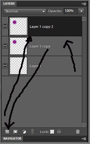
Once you have your dot duplicate it by clicking on your layer in the layer box and then pulling it down to the new layer icon  which is the tiny box that you use to make new layers. Drop it there. It is a tricky little thing but once you get used to doing it you will wonder how you got by without it.
 
 
Now you have two dots exactly the same one on top of the other. Click on the dot in the first box and drag it to the forth box. You now have two dots that are identical in a diagonal formation and in the center of their own little boxes. Nice work :)
 
 
If you have done the swiss dot pattern you will know you are nearly there now. Click on the edit tab at the top of the page and go down to define pattern. In the box name your pattern...polka dot seems about right...and then click ok.
 
Open a new widow 30cm by 30 cm same specifications as before.
 
In the new window go to layer, the button on the top tool bar, then new fill layer, and then pattern. Polka dot should be the top pattern so just click ok.
Ta da, you are now the proud owner of a page of perfectly spaced polka dots!
 
 
I have scaled them up so you can see them better.
 
There is so much you can now do with your new polka dots. Perhaps you would like them a different color.
 
Make a new layer and fill with the color of your choice. Now click on control g (actually one of my favourite control buttons) and your new dots will have changed to your new color.
 
Or perhaps you have a piece of background paper that you really like and you would like to put over your dots. Well put that in a new layer directly above the dots and click control g again.


Things I can do with my new found knowledge
 
 
You can use the knowlege you have learned above to make lots of different patterns. Consider taking a nice flower that you already have and putting that in each of the boxes. Perhaps tilt each flower a slightly different direction for interest.
 
 
I have put them on a plain pink background so you can see them, but you could choose another patterned one. Pretty isn't it?
 
Perhaps next time try one Explore what you can do with it and above all don't be afraid to play around with photoshop, after all, you paid for it :)
 

I would like to change the colour of an element

Changing the color of an element.
 
One thing I love about photoshop is that there are so many ways to do something. And whilst it may seem confusing over time you come to appreciate that different ways give differing results in differing situations. Which means there is always something else you can try if one doesn't work.
 
So starting with the basics. It the object you want to recolour is just a basic flat one colour element such as some text in png format. Open the text in a new window, select the new colour and then paint bucket tool and click on each letter.
 
Or, open a new layer, click on paint bucket and pour in new layer and press control g
 
If you want a toning colour, click on the colour you wish to tone with, open the element and click control u, this will bring up the hue saturation menu. On the bottom right is a box with colorise. Click in there and you will get a toning color. This also works well with elements of one color such as bows and ribbons as it keep the textures and shadows.
 
If you wish to change a plain item to one with a pattern open the item in a window then open the pattern in the window above. Press control g and the pattern will become the same shape as your object and you can still move and resize the pattern to get it exactly where you want it.
 
If you are feeling particulary adventurous, and you are dealing with lots of colours press control u to get the hue menu up. Your first choice is to use in the master setting and slide the hue button around gently. This will change the colors in your picture. It can be fun if a little tricky as although one color may change to something you like another may not. Saturation and lightness can also be gently moved but to be honest don't go overboard lol.
 
Still more adventurous, ok click on control u and then master, a drop down will come down with the separate colors. I do quite like using this method as I can change individual colors. I find it best to work down one color at a time as it is suprising what an individual color changes. I also find if you turn hue right up for that color you can see what it is actually affecting if anything. Then when you change it you can see what is has changed to, then when you are done slide hue back down. Using it this way you can have a layout and change maybe just one aspect such as the reds.
 
At the bottom of the layers box are three little boxes the 3rd being new fill adjustment. You can use this to add a solid color, a photo filter or a gradient. Again a super box of tricks. Photo filter is good for a single all over tint. Gradient has tints but with preset colors such as rainbow or metalics. Play around with these and see what you get.
 
You are still feeling adventurous? Go to the enhance tab and click on adjust colors, color variations. This is quite fun to play around with. Especially if you need an element to have more or less saturation. I use this if I need to change the colur but not the detail and because I can change thing incrementally. Play around with it. It is quite easy, if you want to change the shadows you can either do it by each color or with overall saturation. I have had some good results with flowers that I needed to brighten without losing detail.
 
I am feeling super adventurous, what do you have for me. Well you colud use adjust color  curves, I have used this a few times, it is also fun and gives you an instant preview of what you will get and you can choose preset styles.
 
I think my favourite way of playing around with colors is to use the layer styes. Just above where your layers are there is a little drop down menu that goes from normal to luminescent. When you get the hang of these you can do things that make most people go Wha!!!! How the??? Yse they are that good. The best thing to do is take an afternoon to play around with them. Don't be shy, have fun.
 
So take a pattern paper that you like and open it in a new window. Now open up a layer and give it a solid color. Choose whatever you like, this is just to show you what the layers can do. Now starting with normal use your directional keys to scroll down through the layers. See how each layer changes the paper? Colur will give a more single tone colorful result, hue will keep more of the natural highlights and tones while still changing the color. Screen makes it much lighter. Some you will think 'that doesnt do anything' yet when used on something else it gives a big change.
 
If you have a paper and you want more saturation duplicate the paper and the use the multply layer on the top layer. If the change  is too much the change the opacity. If you need a paper light choose screen and again change the opacity.
 
So get really aquainted with the layers, don't be shy, if it looks terrible then you have still learned something.
 
Got a patterned paper and want to add the pattern over say a ribbon so that it blends rather than be a solid color? Put you ribbon in one window. Then you r pattern in another, now go to the layers and choose soft light. When this works it is really cool. I love using it to add patterns to solid objects.
 
It is also really good for adding textures, but that is a new blog.
 
So, I bet you have learned more about adding color than you ever wanted to know and I am sure there are many more. If I have missed out anything really cool be sure to message me and describe it. I know all this is a lot to take in but think of it as a reference. Come back and read again if you get stuck or want inspiration. I know for me it takes a while. Above all though have fun and experiment, so what if what you makes looks hideous, just loosing your fear of trying something new is a triumph in itself.
 
Claire


How to make a swiss dot pattern

How to make a swiss dot pattern
 
 
This really has to be the simplest pattern of all which is why I am starting with it. Swiss dot is just row after row of dots. But by learning this you are opening up a whole world of pattern making.
 
So are you ready to begin...excellent :)


Open a new window by clicking in your work space and then clicking the control button and the n button at the same time. This will bring up the window above which asks you what parameters you wish to use.
 
This time I am choosing 1cm by 1cm with 300 per inch resolution, RGB colour and a transparent background.
 
So now you have your window open. It is probably very small so use the magnify icon to make it bigger. Click on the magnify button on the left. Now at the top a new tool bar will have appeared just above your workspace that says fit screen , fill screen and print size. Click on fit screen. Get familiar with these buttons because when you make elements you will probably use them a lot.
 

So now you have your screen and are chomping at the bit. Where are my dots I hear you say. There are two ways to get your dot. The simplest way is to get your brush by clicking on the brush icon on the left hand menu. If you can't find it it may be because at the moment yours looks like a pencil. Click on the pencil and then right click, this will bring out a new menu, choose brush. Once you have your brush look at the top menu which has now appeared. This menu gives you the choice of what brush to use and what size.  Choose a hard brush, it doesn't really matter what size as you can adjust this using the size slider and pick any colour you like. Put a dot in the middle of the square.
 
It will probably look a lot like this. You may be wondering well is this in the middle. To be very honest with this particular pattern it doesn't make any difference at all, but as you move on in pattern making it will so if we are being very picky we can get out rulers out. Rulers are in view tab up the top where my arrow is pointing in the picture above. A drop down menu will come out and you pick rulers. The rulers will now show as a white edging along the top and left side as in my picture above.

Carefully click in this white line and then drag across the screen from the left side. A line should come out. Pull it across to 0.5 on the ruler. And then again from the top. You will now have your exact centre. Remember this for future pattern making :)

 
How big should I make my dot? Well the fun of photoshop is in the experimenting. So I want you to make your own choice and then if it is not to your liking you will know if it is too big or too small. Consider this though the smaller the dot the more spaced out your pattern will be. If your dot fills the whole screen there will be little space in between.
 
Now click on the edit button along the top and click define pattern. In the new menu give your pattern a name...dot seems good... and then click OK. Phew! You are so close now.
 
So click control n for a new window. Make this one a lot bigger. If you are making a background about 30cm by 30 cm, 300 per inch resolution, RGB, transparent is good.
 
In your new layer click on the layer tab in the top row it is the 5th button along. Drop down menu go down to new fill layer and then a new drop down choose pattern.
 
Your new pattern will always be the first one that loads so just click OK on the box that comes out.
 
 
Da da! You have dots! And lots of them. Take a bow and feel proud of your creation. The box that is showing gives you a chance to scale the dots bigger or smaller. The ratio between them will always be the same though. So if your dots are too close together go back and make your dot smaller, or vice versa. Now you have this pattern it is yours and there is so much you can do with it. I get a little excited about patterns because I love them so much. Must be the autism in me. Well you can rest now if you want to. Save your page of dots as a png file because you want to keep the transparent background.
 
 
Or...... you can choose the second method, after all you know your way around photoshop a little better now.
 
So open a new window with control n and choose 1 cm by 1cm parameters as before.
 
This time go to the shape button. It looks like a heart on the left hand menu. Now the shape menu will open along the top bar. Here you can choose shape and size. For a dot we are going to choose a filled in circle.. which is the one that is solid black and make the size 0.5 by 0.5.
 
Click in the middle of your window and a circle will appear. You can now resize this if you wish. If you look at this dot in comparison to the one made by the brush you will see the edge is more defined. So the shape method gives a cleaner dot. Is this better? Well yes and no. If you want well defined dots in your pattern this is for you, if you want a pattern that blends then perhaps brush is better.
 
Once you have your dot in place get the marquis tool and surround the dot. Then click move and left arrow. This will surround your shape then the computer asks you to simplify the shape click ok. Why am I doing this? Well unless you simplify the shape you can not use it to define as a pattern because shapes are vectors not rasters. Look up the definitions of these if you want, but know that this is just how it works :) now follow the instructions above to get your pattern.
 
Why have I given you the second method...well it is because this also opens up new options. Why just have a dot...what about hearts...or flowers? You see I don't want to teach you just how to make one pattern. I want to teach you the method to make anything you want. With confidence you will have opened the world to amazing background papers.
 

Here I have chosen to use a heart shape and I have scaled it up so you can see it better. I look forward to hearing you have made a start to creating great patterns.

Claire